RAINBOW LOVE APP
UX TASK ANALYSIS
DESIGN WORK

RAINBOW LOVE APP
UX TASK ANALYSIS
DESIGN WORK

Rainbow Love App is a rainbow filters photo editing app. First released Nov 2014, it’s had 100,000 downloads and has had 47 app updates.

User survey, Contextual Inquiry, User Interviews, User Flows, User Testing, Iteration


WHY UX
Rainbow Love App’s analytics shows that a low number of users save their final image after selecting a photo to edit. We will benchmark the problem (which we’ll call the “The Task”) with a closer look at the app’s analytics and user flow to gain baseline insights on why users aren’t completing the process with ease and joy.
THE GOAL
Research and understand “the problem” and find meaningful and effective design solutions that increase the user completion rate.

ONLY 27% USERS
THAT START THE TASK, COMPLETE IT.
User dropout occurs at every step with the biggest drops with 40% saving filter and 27% for saving final image.

USER INSIGHTS
27% of users that start the task, complete the task. When we look at the events of all users we find that overall.
33% users preview filters
21-25% users edit and save filters
19% users save a final image
2% seven-day retention (data not shown)

DISCOVERY & NEXT STEPS
Why don’t users complete the task?
Where are the problems for completing the task?
How will better task completion affect retention?
Next Step: Research

December 2019
45 responses
December 2019
4 participants
December 2019
January 2020
8 participants

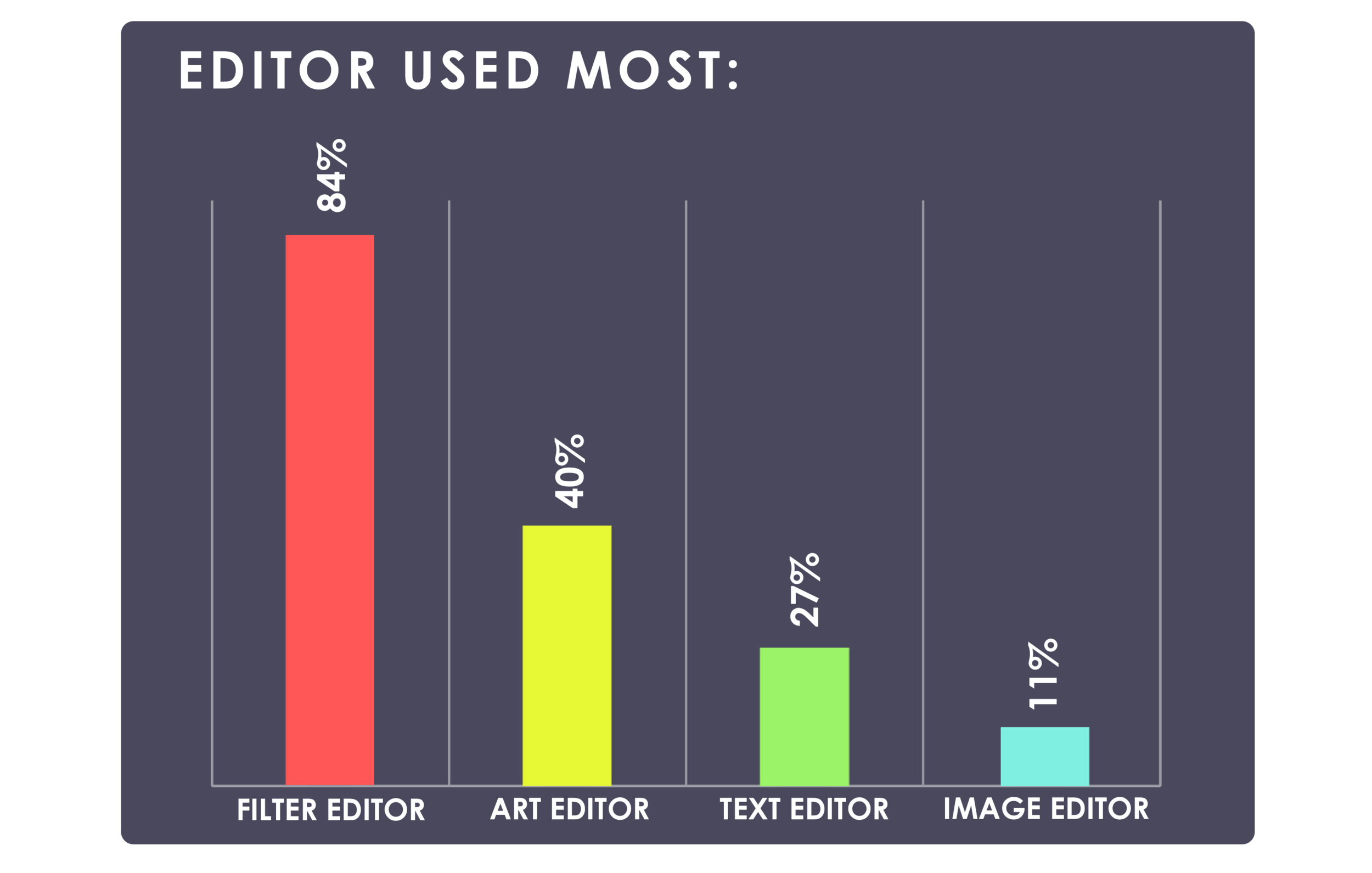
84% USERS USE FILTERS
as their most used feature of Rainbow Love App
WHY IT’S IMPORTANT
Validates that filter task is a priority for UX

41% HAVE MOST DIFFICULTY EDITING, SAVING AND DELETING FILTERS
67% were unsure if filter edits were saved
48% could not find filter packs
Only 8% had difficulty saving final image
WHY IT’S IMPORTANT
Reveals that editing and saving filters are the issue areas in “The Task” not saving the final image.

GUIDES & APP SUPPORT
49% said guides were unclear or take too long
38% described app as “not intuitive”
29% said hard to find guides, help and support
WHY IT’S IMPORTANT
Is it easy for users to learn the app? Are the guides easy to find and helpful?

LIKABILITY & EXPERIENCE
87% said the app makes them feel “happy”
49% reported they use it 1-3 per month
36% said it was their favorite photo editing app
59% ranked it as one of their top 3 apps
58% rated it as “great but can be better”
WHY IT’S IMPORTANT
Suggests that users like the app and there’s some “Design Capital” with users to make improvements.

OBSERVATION
Contextual Inquiry asks users to be observed completing a specific task. Testers are given minimal guidance and observed to see how they interact with the app revealing pain points, needs and opportunities.
Participants were asked to add three different filters to a photo they selected and to save their final image. Following observation, users were interviewed.

CONTEXTUAL INQUIRY
4 testers observed and interviewed
12/20/2019 - 12/28/2019
Versions: 2.24 and 2.25
3 testers had experience with other editing apps
1 testers had no experience with editing apps

FINDINGS
Users did not know the filter pack bar scrolled
Users did not know they could double-tap a filter to edit
Users tried “touch” to edit the filter on their photo
Users showed uncertainty in at least one step
Users had difficulty deleting filters
Users were uncertain if they had added a filter
“I added a filter, but found another one I liked better. I couldn’t figure out how to delete the first filter I saved. You need an UNDO button.”
“It would be really helpful if there was an easy way to see all the filters I’ve added.”
“It wasn’t clear to me that you can layer filters and add more than one filter.”
“How do I clear the filter I selected in preview from my image? I didn’t know if it would save with my image.”
“I wanted to go back, and wanted a help button but couldn’t find one.”
“I didn’t know I could edit the filter until you showed me to double-tap the filter preview.”
Rainbow Love app has low completion rate for the task of editing and saving a filter and saving a final image to their phone. Only 27% of users that upload their photo, save a filter and a final edited image. Research revealed user needs to solve the problem and opportunities to improve the overall experience.
I believe that by implementing additional user paths to edit and save image, and providing in-app messaging to guide the user, I will increase the completion rate of the task of saving a final filtered image. By implementing “opportunity” features found in research I believe I can further improve the user experience in a second update.


USER NEEDS
Easy way to edit, save and delete filters
Better guides and more accessible help
Undo or go back feature
OPPORTUNITIES:
Touch Gestures / Favorite Filters / Layout

DESIGN SOLUTIONS
Research revealed an array of design solutions, which were evaluated and prioritized based on cost and their ability to positively impact the task completion rate.
Undo button
Touch gestures
Guides, Progress Bar, Help
Scroll Bar indicators
My filters / favorites feature
Design solutions included in-app user messaging, new user touch paths to take users to filter editing and save screen, scroll bar indicators to show that the filter bars moved, and an undo button.
Version 2.26 was released Jan 24, 2020
The “task” user flow shows that in order for a user to Save a Filter, the user must Edit the Filter. To Edit a Filter the user must double-tap the previewed filter but research showed that users did not know this.
Instead, Contextual Inquiry showed that all testers tapped the filter on their main image and expected something to happen.
Some testers tried tapping the preview a second time.
So instead of changing the user flow, in-app messaging was implemented to guide users and additional paths were created to take the user to the editing screen where they could edit and save the filter.

Added “touch" main image as new path to edit filter
Added “second tap” on preview as new path to edit filter
Added arrows to scroll bars for filter bar and packs
Added a line around uploaded image area
Added an “Undo” button to give users more control
Added in-app messaging to guide the user
Added the word “save” to the save final image button
Changed button for saving filter from “SAVE” to “SAVE FILTER”
Pop-up guides were designed and placed into the app at specific user actions to guide and provide confirmation to the user. The “To Edit” pop-up would display when a user previewed a filter. “Filter Saved” would appear when a user saved a filter.
The undo button offers the user 3 options for removing or deleting filters.
Messaging was tested with users with revised versions being implemented in phase one.

Testing with users found that messaging was still “too long” and the pop-up messaging created a nuisance for users that no longer needed the help. This feedback was used to make a second around of improvements.

This update solved for findings regarding in-app messaging and also implemented opportunities found in research that may improve the users’ experience with Rainbow Love App.
Design changes included:
Shorter in-app messaging
Allow users to turn help guides on or off
Touch gestures for editing filters
Allows users to “favorite” filters, creating their own pack they can access with ease.
A completely new user guide.
Version 2.27 was released Mar 16, 2020
The new help guides were designed for mobile on a Wordpress website accessible from the app. The screenshots show how the guide appears to a user. The guides were sorted topics that most users sites they have difficulty with as the surveys revealed. The first topic is “How to Save” Filters.

RESULTS
14% increase take completion in Phase One
16% increase task completion in Phase Two
Only 2% increase for implementing user opportunities
Adding guides and progress confirmations (not features) provided the biggest boost in users completing the task.

