ANTHROPOLOGIE DOG
USER CENTRIC DESIGN
CASE STUDY


ANTHROPOLOGIE DOG
USER CENTRIC DESIGN
CASE STUDY

USER CENTRIC DESIGN
The goal of this project was to design an e-commerce microsite based on the needs and opportunities a given persona. User research included information architecture, content strategy, competitive analysis and user flow.
The designed wireframes are based on the research data.
WHY A MICROSITE?
A microsite allows for user centric design and may also attract new customers to an existing business.
Anthropologie is an American clothing retailer operating more than 200 stores worldwide which offer an assortment of clothing, jewelry, home furniture, decoration, beauty, and gifts. Anthropologie is part of URBN brands, which includes Urban Outfitters, Free People, BHLDN, and Terrain.


This included a visit to the existing site and brick and mortar store to observe store layout, the nature of the customers and sales associates as well as interactions. This simple observation method helps the designer to understand the ethereal personality of the business on which the customer connects with the brand.

IN-STORE
Observations: Dog friendly, observed 2 customers with dogs, associates displayed calming happy energy. Product displays highly organized and artsy and interactive.
WHY IT’S IMPORTANT
With user centric design, the site should “speak to its user” like a friendly human. Ideally the site maintains the feel and energy of an in-store human experience. This is called “site speak.”

WEBSITE
Observations: Colorful, playful yet sophisticated. Feels that it was designed with care. Also micro sites already exist within the site for registry and blogs.
WHY IT’S IMPORTANT
To understand current functions and features existing customers may expect. To see the site speak, understand the labels used, navigation and how existing products are organized and shopping cart.
User centric designs begins with a detailed understanding of the persona (or target customer). Who are they? What are there needs, pain points? And what opportunities do we have to create a better experience for them?

MEET ANNA
Anna is 36, she’s single and lives in Atlanta working as a graphic designer. She has a 4 year old golden retriever named Dash who’s the love of her life. She spends $35 per week on dog toys and gadgets and regularly brings Dash on her road trips, shopping, to brunch and dog parks. She actively posts her adventures with Dash on social media.
“I need an easy way to get cool things for my dog so we can spend more time on our adventures.”
Lack of sufficient product information
Difficult navigation
Expense or unclear shipping charges
Complex returns process
Lack of trust with unfamiliar brands
Quick access to a range of products
See what’s new on repeat visits
Reassurance of familiar brand names
Social “proof” of what’s cool
Feeling of a relationship with brand
Establish trust and relationship
Focus on new additions to inventory
Free shipping and easy returns
Product ratings to show other customer behavior
This site will feature a variety of 40 dog related products. Card sorting research methods with 5 participants help to understand how the products should be organized and what “labels” are most user-centric for navigation. This is called fitting the mental model of the user.


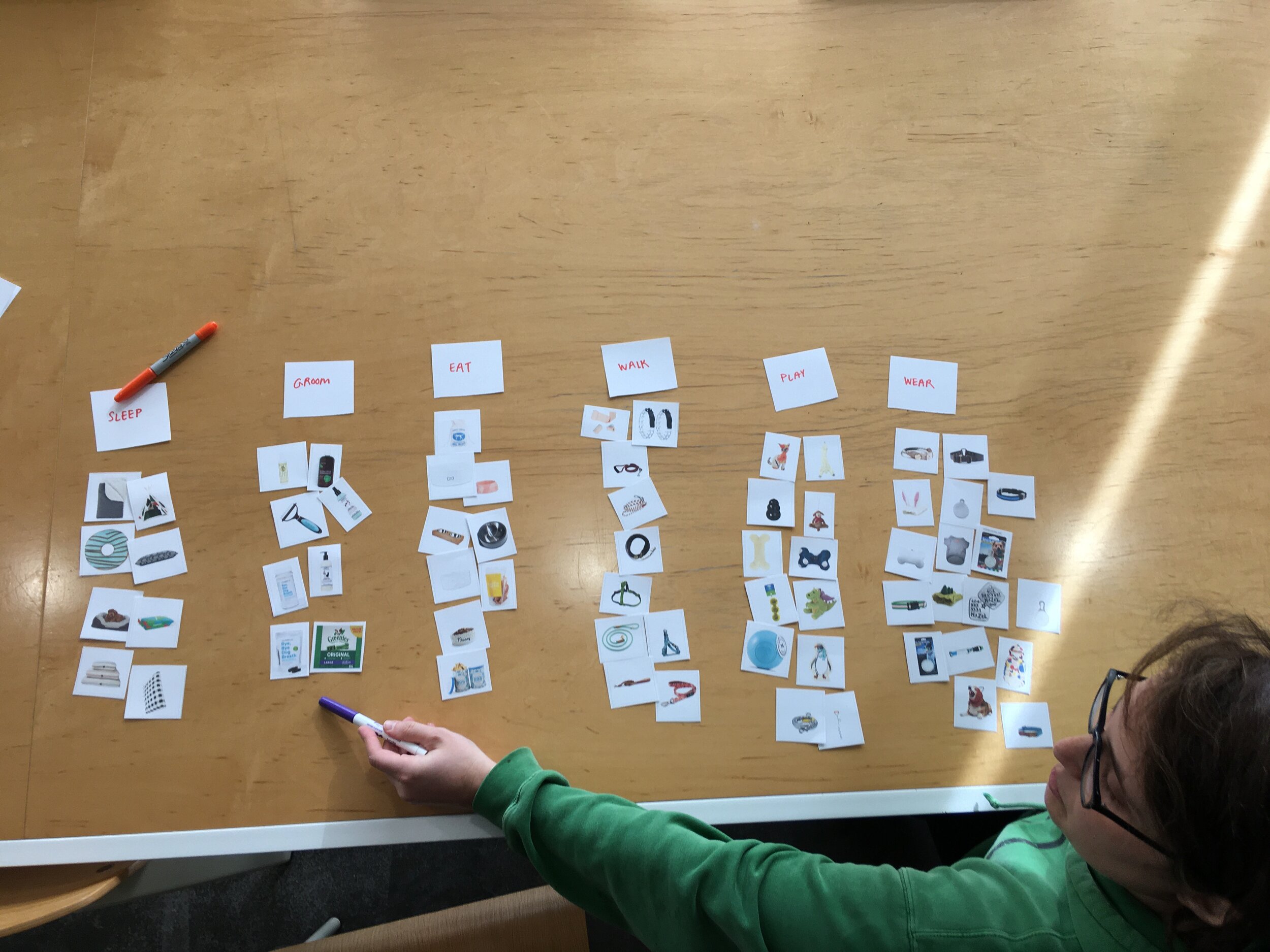
CARD SORTING
To establish product groupings that makes sense and feels predictable to the user, card sorting was done with 40 products and 5 testers. Images of the products were given to testers who were asked to sort the products into five groups and create a label for each group, even if they weren’t sure what the product was.
3 OPEN CARD SORTS
5 CLOSED CARD SORTS
FINDINGS:
Testers successfully sorted products into similar groups and 5-6 main categories. Categories labels were consistent except variances occurred for leads and outdoor toys for dog owners who lived in a house compared to an apartment dwelling.

SITE MAP
Content organized by results of card sorts. Navigation and sub-category labels created by card sorters dictate activities a user may do with their dog.
The five navigation options are to shop by Walk, Feed, Play, Sleep and Groom. With other products sorted by category so that each navigation menu option will feature a drop down menu for faster navigation.
A competitive analysis included the evaluation of 4 similar sites that catered to the persona and currently sold dog related products. Key findings are highlighted in the chart below.


Bloomingdales.com (pets)
Nordstrom.com (pets)
TheFoggyDog.com
HarryBarker.com
3 sites had ten or more navigation categories
3 sites featured four products per row on the Product Category Page
No consistency on filter and sorting of products
Ratings were displayed but showed no or low engagement
All sites featured additional related products on the detail page
1 site offered option to favorite or wishlist items
All sites had account option
All sites offered some form of Free Shipping
Activity related navigation labels
Easy account creation or login
Shopping cart user flows
Easy checkout process
Donate % sales to related cause
Rewards programs
User centric lifestyle content
Community engagement
Easy to Find Products & Navigation
User Flow “Happy Paths” Keep Shopping
Easy Checkout, Free Shipping & Easy Returns
Personalized Account Options & Content
Community Engagement & Features “Social Proofs”


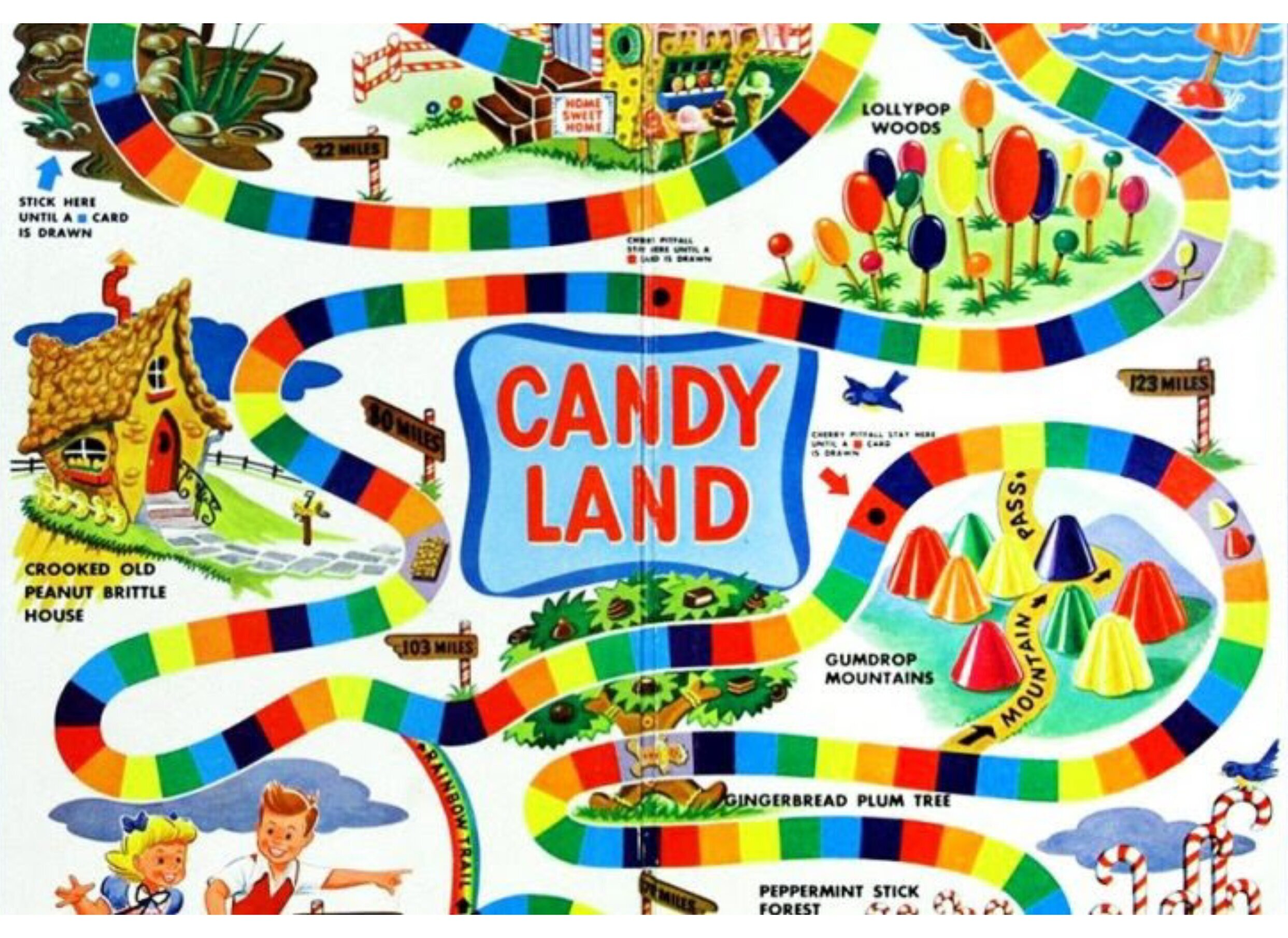
A “happy path” is a user flow that feels like Candyland whereby the user needs are met and answered in various points of the site. This gives the user control, knowing where they are and where they can go, while offering personalized content “yummy treats” throughout their shopping experience.


Adopted from competitive research and modified for our persona, this “add to cart pop-up design” and user flow keeps the user engaged with easy options to checkout at anytime, edit cart or keep shopping.
By integrating the cart as a pop-up the user can easily navigate back to shopping or straight to checkout without leaving the current product page screen.


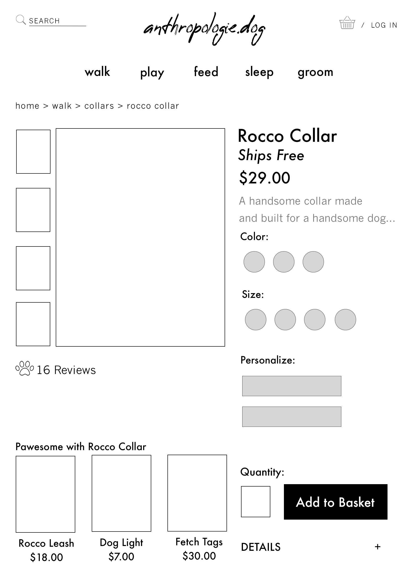
Checkout is designed to be as simple and easy as possible, with a one screen layout. User has option to provide data in 3 steps, with the option to edit their cart or add items and return to shopping. Option to save data creates an account, log in offers option to create an account.
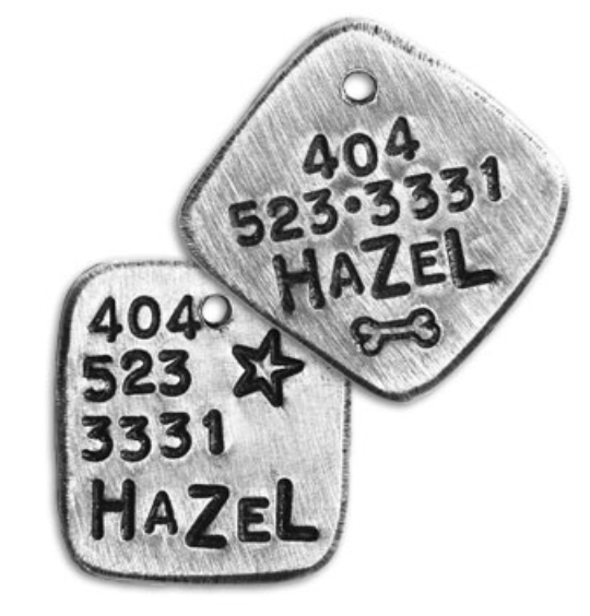
In building on upon the user-centricity of the design user accounts have been designed for personalization. Each user will be able to manage their info, payment, shipping orders and rewards with their account. They will also have the option to include their pets’ in their profile, along their pets’s birthday and other details.

The low fidelity wireframes were user tested with three users to validate the designs. Testing found that much of the design worked well. Testers were confused about signing into an account or creating an account. All three testers found the promotional banner about “points” on the product detail page to be out of place. Two users also suggested using paw icons instead of stars for product ratings and reviews. These changes were implemented into the final design.

Change Log In label to “Sign In / Up”
Remove promotional banner
Paw icons for new items
Change ratings under product detail to color options


